How to Choose the Right Color Palette for Your Home
Creating the perfect ambiance in your home involves numerous design elements, but few have as immediate an impact as color. The right color palette can transform a space, affect your mood, and even influence how you perceive the size of a room. Here’s a comprehensive guide to help you choose the right color palette for your home, ensuring your personal sanctuary reflects your style and meets your functional needs.
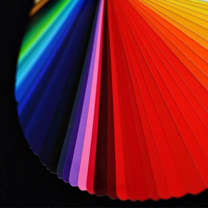
Understanding Color Basics
Before diving into color selection, it’s essential to understand some basic color theory concepts:
- Color Wheel: The color wheel is a tool that shows the relationship between colors. Primary colors (red, blue, yellow) mix to create secondary colors (green, orange, purple), and further mixing results in tertiary colors.
- Color Schemes: Common color schemes include monochromatic (variations of a single color), analogous (colors next to each other on the color wheel), and complementary (opposite colors on the wheel).
- Warm and Cool Colors: Warm colors (reds, oranges, yellows) are energizing and cozy, while cool colors (blues, greens, purples) tend to be calming and spacious.
Steps to Choose Your Color Palette
-
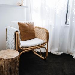
Assess Your Space:
Start by evaluating the space you’re working with. Consider the room’s size, natural light, and existing elements like flooring or furniture. Light colors can make a small room feel larger, while darker tones can create a sense of coziness. -
Determine the Mood:
Decide on the mood you want to evoke in each room. For instance, a bedroom might benefit from calming blues or tranquil greens, whereas a dining room might be more inviting with warm, rich hues. -
Consider the Flow:
Ensure a cohesive flow throughout your home by selecting a consistent palette or complementary colors. This doesn’t mean every room needs to be the same color, but the transitions should feel harmonious. -
Start with a Focal Point:
Identify a focal point, such as a piece of artwork, a rug, or a piece of furniture, and build your palette around it. This ensures that your colors are tied to a central theme. -
Use the 60-30-10 Rule:
This classic design rule suggests dividing your color scheme into 60% primary color, 30% secondary color, and 10% accent color. This ratio helps maintain balance and interest. -
Test Samples:
Paint swatches and fabric samples are invaluable tools. Test them in different light conditions before committing. Remember that colors can look different in natural versus artificial lighting. -
Consider Finishes:
The finish can affect the perception of color. Glossy finishes reflect more light and can make colors appear lighter, while matte finishes absorb light and may make colors appear darker. -
Stay True to Yourself:
Ultimately, your home should reflect your personal style. While trends can provide inspiration, it’s important to choose colors that you love and that you’ll enjoy living with over time.
Common Mistakes to Avoid
-
Overcomplicating the Palette:
Too many colors can overwhelm a space. Stick to a few key colors and use variations to add depth. -
Ignoring Lighting:
Always consider how natural and artificial light will affect your chosen colors. A color that looks great in a sunlit room may not look the same under fluorescent lighting. -
Disregarding Existing Elements:
Always factor in existing fixtures, fittings, and furniture that you plan to keep when choosing colors to ensure everything works together harmoniously.
Conclusion
Selecting the right color palette for your home is a blend of art and science. By understanding color theory, assessing your space, and considering your personal preferences, you can create a living environment that feels just right. Remember, the most important thing is that your home reflects who you are and provides a space where you feel comfortable and happy. Happy decorating!